A guide to preparing images for the Mobile BE
The aim of this brief document is both to set guidelines and to cast some light on image management. For that purpose, we’re going to highlight the following aspects:
1. Image Proportion
The proportion of an image is the ratio between the width and the height of the photo. Some of the most common used ratios are:

Specifically in the hospitality ambit, we are used to seeing wide rectangular pictures that display room spaces more efficiently.
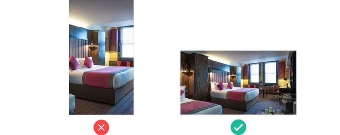
RECOMMENDATION - For the sake of visual consistency in V10 Mobile, we suggest using 16:9 ratio proportion in a rectangular landscape perspective.
2. Composition of Photographs
What lies behind this concept is how we grab and focus users’ attention on a scene, how we place elements in the frame when taking a picture. In our specific case, we are talking about room pictures that will depict bedrooms, bathrooms, terraces, hotel facades etc.

RECOMMENDATION - When uploading photos, choose ones where the frame is centred around the most relevant items of the photo (bed, window view, desk etc.).
3. Resolution
This concept refers to the number of pixels in an image area. Usually the more pixels in a given area the better quality image.
Mobile device screens have 2x (and even 3x) the resolution of typical desktops which means that they need to work with double or triple size images in order to look sharp and not result in blurry images.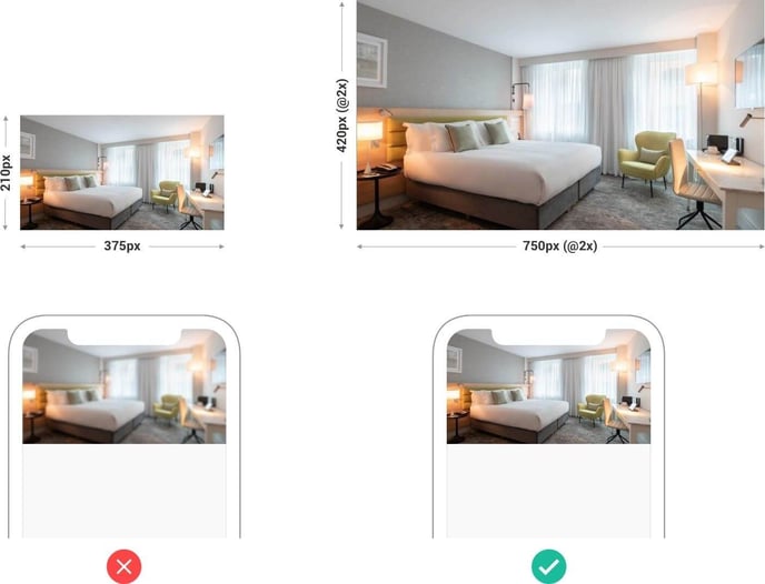
RECOMMENDATION - We suggest providing images at least with a 2048x1152 pixel size (it fits the proportion 16:9 See point 1).
4. Text in images
It is strongly recommended NOT to embed/insert text in the images, at least text meant to convey real information. While this is common practice in graphic design (in magazines, posters…), it is not appropriate for many reasons web design. Just a few reasons:
Poor maintenance: if you need to change the text you’ll have to edit an image, recreate it, and upload the picture each time you change.
Bad for Google: image texts won’t be read and won’t be indexed and thus Google won’t find them or use them to enhance your SEO.
Anti-multilingual: you will have to create different versions of an image with the texts translated for each of the languages your web may be viewed in.
Masking: text can be cropped sometimes because of the need to 'mask' the images. This is particularly true on mobile, where the layout requires strict control of the relative sizes of images, text and other visual parts of the page.
Accessibility: screen readers to help the impaired will not read the content of images and if this is the sole way to convey information, it will be lost.
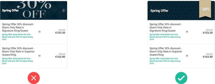
RECOMMENDATION - If you want to grab user’s attention, try with other kind of visual supports like ribbons, badges, or icons as wallpaper… but do not rely on text in images to convey much information.
5. “Masking” in V10 Mobile
More than a suggestion, this point refers to a technique we use. Since Bookassist’s system has very few restrictions regarding what images hotels want to upload, we need to make sure that the final design layout is not broken when users upload images that don’t match the recommendations above. In other words: we need to protect our Booking Engine design first and foremost, and for that purpose we use masks to constrain images.
But what is a “mask”? In web design, a “mask” is a layer that contains an image which hides part of that image so that what’s shown conforms to a predefined size. This way we avoid breaking the design layout by trying to accommodate random shaped and/or sized images.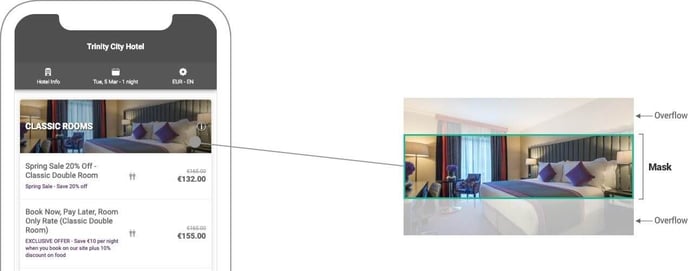
6. V10 Mobile Booking Engine image scenarios
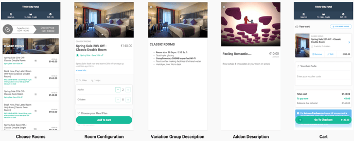
Here we show the main scenarios were hotel images are displayed in V10 Mobile Booking Engine.
