Best practices
There are some important items on the homepage and internal content pages to consider when creating a website.
★ Platinum features are not available to Custom clients but they can be activated individually on request. Please contact us at team.wd@bookassist.com
☆ Important for both Platinum and Custom clients.
Logo
Go to Section 1. "Configure your site” > “Logo configuration”.
We recommend the logo to be in .png format and of good quality (png-24). Other formats are also possible, such as .jpg, .jpeg and .gif
Main Navigation
Go to Section 2. "Manage content” > “Menu & Pages”.
This may be different depending on the style chosen but there are some suggestions available for all styles:
-
Keep it simple and have a condensed list of menu categories. If there's a lot of content, it is better to make use of the second and third-level menus.
-
The Main menu title should be short. Then on the page title, you can be more descriptive and use keywords.
Main Image Carousel
Go to Section 2. "Manage content” > “Images" > “Image data".
The ideal is to have five or six images in the carousel to showcase the main services of the property, for example, the facade, reception, the rooms, restaurant, the city or the nearby surroundings.
Recommend: After uploading images to the CMS, add the titles and subtitles to the image data. For the room’s images for example, the best option is to put in the title ‘Rooms’ in the subtitle, name the available type of rooms, put a Call to Action button with ‘Book Now’ and link to Reservations. Another good idea is to write a welcome message in the first image as to be open and friendly on first visit to the site.
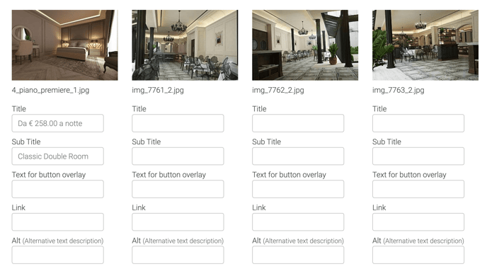
Another option: if you prefer, you can put a video on this part of the website.
-
This video has been uploaded in the account of Vimeo Pro.
★ Best Price
Go to Section 3. "Optimise sales” > “Best Price".
The best price is a convincing message that not only is used to boost reservation but also transforms your website into a loyalty platform: if the client is sure that your website guarantees the minimum price, they will not hesitate to book through your website.
What information can we show at the best price? Here some examples:
-
Show the message ‘Best Price Guarantee’
-
Matched price if the customer finds a better offer or can be refunded the difference if the payment has already been made.
-
Offering an additional discount
 This is an example in the Klimt Style.
The presentation of this section will change depending on the theme styles. View & Compare.
Main Content
Go to Section 2. "Manage content” > “Menu & Pages” > "Edit Page"
Include 3 or 4 paragraphs about the property, location and a list of services. This will be the first text that the customer will read so it’s important to be clear, concise and only show the main information.
☆ Content Blocks
Go to Section 2. "Manage content” > “Menu & Pages” > "Edit Page"
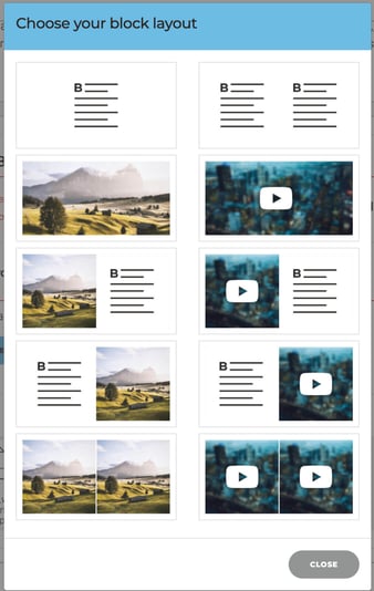
Besides using the main content area, we can break up the text using content blocks to vary the layout and presentation of information.
Recommend: use content blocks to layout the main list of services, such as restaurant, weddings, meetings, spa, etc. This is a good way to provide a summary of information using images, text and links to individual pages with more content. As well as the option to have content split left and right, top and bottom, we can also layer images in a carousel. This provides for a multitude of options in a very flexible layout. See possible combinations below
Read more: Content Blocks
Read more: Video content blocks
☆ Good To Know
Go to Section 3. "Optimise sales” > “Good to know".
What information can we include in this section?
For example:
-
The time of check-in?
-
The time of chek-out?
-
Opening times of some services?
-
Information about reservations: special rates for children, if pets are allowed or not, if there is parking and if it is paid or free?.
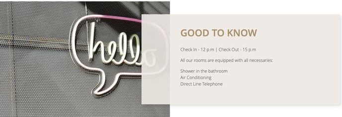
This is an example in the Klimt Style.
The presentation of this section will change depending on the theme styles. View & Compare.
Featured Banners
Go to Section 2. "Manage content” > “Menu & Pages” > "Edit Page"
This feature can be used instead of content blocks to display relevant information about the property and services it provides. It differs slightly in that it works more as a visual link with the image being overlaid by the text content. For instance, we’ll have an image banner that when rolled over, the text will appear. These banners can be displayed in a variety of arrangements:
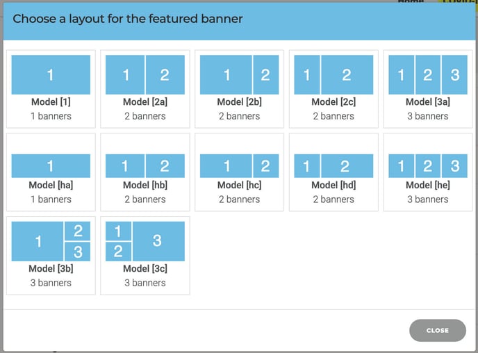
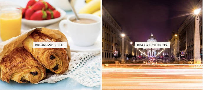
And when you roll over the image:
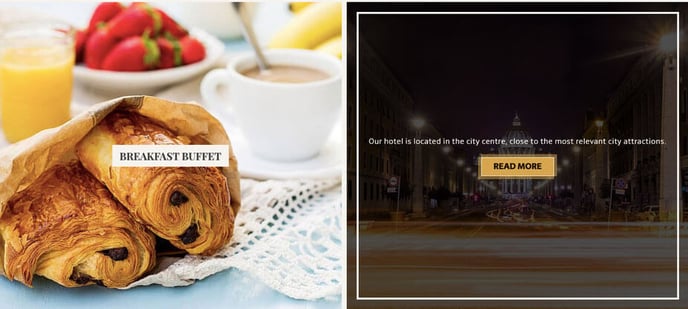
Read more: Featured banners
Standard Banner
Go to Section 3. "Optimise sales” > “Banners".
The standard banner will appear by default on all pages of your website. The only exception will be the Klimt theme that allows you to manage this on a per page basis using page modules. You will need to create two banners before you are able to assign these to the standard banner setup, as shown below.

These banners consist of an image, text and also a button with an internal or external hyperlink.
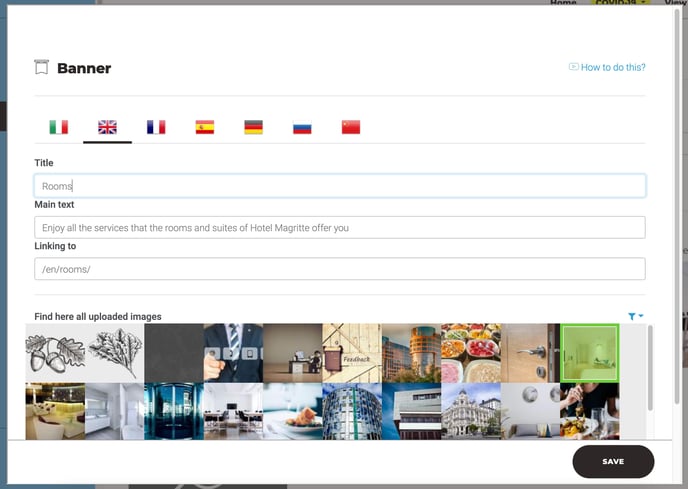
The structure would be like this:
-
Title
-
Main text: not too long
-
Link to
-
Image
Read more : How can I create a new banner?
Secondary Video
Go to Section 2. "Manage content” > “Videos”.
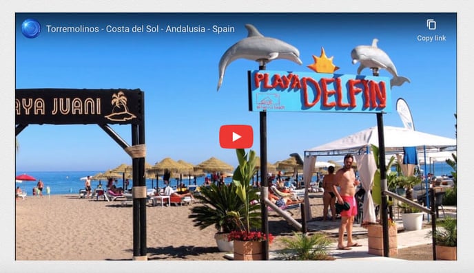
As we have seen before, you can put a video in the main home image carousel but if you prefer you can use the option: Secondary video.
This video will appear within the content, it’s an iframe that shows a video from Youtube or Vimeo.
Example:
Read more: Videos (home, secondary & content blocks)
☆ Unique Selling Points (USPs)
Go to Section 3. "Optimise sales” > “USPs".
Three important points to ‘sell’ the property. This element is different in each style, but in all of them, it’s made up of an image and a text.
How does the text have to be?
-
Clear
-
Short
-
Concise
Example:

Also consider using Good to Know or Best Price to display this information. Depending on the theme you are using it might be better to inter-change this info to change the way this info is displayed.
Location Map
Go to section 1. “Configure your site” > “Property main info” > “Location”.
It’s important that the client can see the location of the property and its surroundings. To do this, we will change the map zoom if necessary.

★ Newsletter
Go to Section 3. "Optimise sales” > “Newsletter Module”.
The newsletter is important for customer engagement and SEO. It’s a perfect tool for marketing, not only to improve the communication with customers with the latest news and offers but also help better understand your customer. In terms of SEO it can only encourage bookings through increased traffic and conversion to the website.

Read more: Newsletter Module
Social Networks
Go to Section 1. "Configure your site” > “Social Networks".
Another excellent way to encourage customer engagement is the addition of social networks links to the website. Fortunately this is made extremely easy though the CMS, so why not include as many as you can!
This is an example of social networks looks like on the website:

Footer
The sitemap, disclaimer, best price guaranteed or booking conditions and privacy policy are the most important elements for the footer. Generally customers don’t need access to this information but it's essential for security and legal information.
★ Promo-code
Go to Section 3. "Optimise sales” > “Newsletter Module”.
Its use is widely spread, during 2019 close to 90% of customers have used this type of discount. This data gives a leading role from which all brands should take advantage.
In recent years, promo codes have proven to be highly effective tools to increase sales of any type of business:
-
They help reactivate “sleeping clients” and loyalty assets.
-
They can attract new customers that without an attractive discount, they probably wouldn’t have converted.
Price is a matter of maximum interest for any costumer, this added to the excess supply, can become a great competitive advantage for those brands that are aware of the power of discounts.
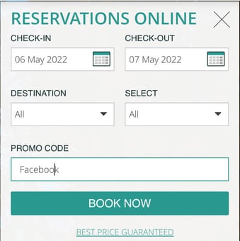
Read more: Promocode by default
★ Pop up
Go to Section 3. "Optimise sales” > “Popups".
There are two options in the pop-ups: the home pop up and the abandon pop up.
A pop up is used to make specific content visible such as, a service, a special product, a campaign (valentine’s day, Christmas, etc. ) or any other news / event that may be of interest to the customer. E.g. Covid 19 information
Home pop up: It is interesting to use this to show information regarding the hotel, the property, information that we need the client to know.
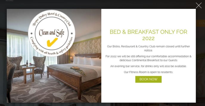 This is an example in the Mondrian Style.
The Abandon pop up: is recommend the use of this pop up to retain the customer on the reservation’s page.
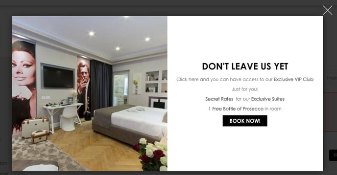
For both you can also choose between the Standard above or Promo Form that collects the customer email and sends a promo link to the reservations page.
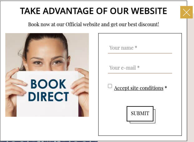
This is an example of PROMO in Popup the Dali Style.
Read more: Welcome pop up will not deactivate?
★ SEO (Search engine optimization)
Go to Section 3. "Optimise sales” > “Customised SEO".
Websites with good SEO have the best chance to be shown in the first positions in the search engine rankings. Google (the main search engine) benefits those websites that use good SEO by putting them in the first positions on their results pages.
Best practices
-
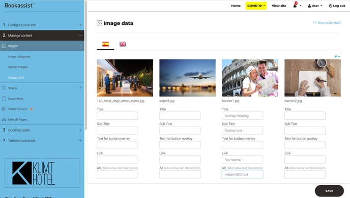
Images Optimisation: Use Images with size 2048 px width and max size file 3 MB, the main formats accepted are .jpg, .jpeg or .png
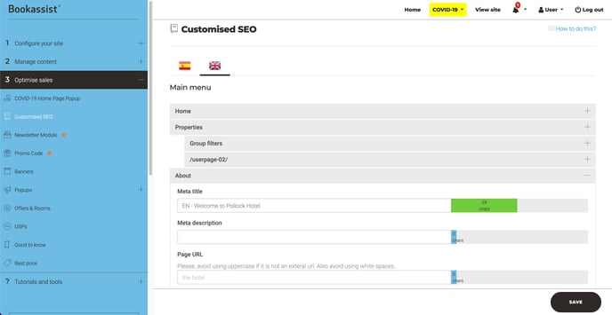
Adding image data, specifically alternative text is often the best way to add real value in terms of SEO. Simply add a brief description of the image, include keywords to the fields provided in the Smart CMS.
-
If you can fill each field, Google will benefit your website.
-
Contents: It is important that the content is clear and readable.
Divide the content into paragraphs, use titles and keywords in bold, use external and internal links.
If you can, have more visuals on the page by including more images, making use of font icons and incorporating them into the content.
By taking advantage of all the functionalities provided in the SMART CMS and adopting best practices will help to present the content in a compelling manner.
Example
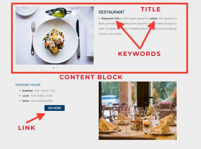
Note: Google penalizes those websites that have duplicate content, so it is important that we do not use the same content on different pages.
-
Keywords: The keywords are the most relevant part of the SEO, we must use the keywords in:
-
Titles.
-
Subtitles.
-
Url.
-
Images.
-
Content.
-
Description and Meta description.
-
You can add description and meta description per page in the CMS

-
Optimize the URL for each page: The url of the pages have to be descriptive, the best option is to put a URL similar to the main title of the page.
We have to put URLs without capital letters, without spaces [If we want to separate the words, we use (-)] neither strange characters (ñ % ^...)
We can optimize the URL on this section from the CMS:

For example, if we want to customize the url of the hotel page, the url will be the-hotel.

Please contact us for further assistance and include URL link in the ticket: