1. File name
Images cannot be renamed once they are uploaded to the CMS.
It is best practice to have images sized, optimised and named before upload. Adopt the following naming convention for example:
hotelname-location-keyword.(png/jpg/pdf).
Avoid special characters: Use only alphanumeric characters (letters and numbers) in file names.
Remove whitespace: Instead of whitespace, use underscores (_) or hyphens (-) to separate words in file names.
It is a good idea to think of the naming of images & pdfs as something similar as to how you would create a page urls for potentially adding SEO value.
2. Upload image size
The key here is to prepare one size of image that can be uploaded to the Smart CMS and the Booking Engine. The idea being that one size at high resolution can be used to produce multiple images of various smaller sizes than the original.
The CMS requires a high resolution image 2048 X 1280 pixels (Ratio: 16 : 9). Max file size: 5MB
What is resolution?
This is dots per inch and for the web we require 72 dpi which is screen resolution. Images for print in contrast require a minimum 300 dpi.
Background Image Carousel
Home page - Images are scaled by width and cropped to height 1920 X 1280 (width x height)
(Orientation: landscape | Aspect Ratio: 16 : 9)
Mobile Home page - Images are cropped to width 985 X 1480 (width x height)
(Orientation: portrait | Aspect Ratio: 2 : 3)
What is cropped?
This is the area trimmed or removed from the Image in order to achieve the correct aspect ratio. Images are cropped by the CMS from the center origin.
What is aspect ratio?
The aspect ratio of a display device is the proportional relationship between the width and the height of the display. It is expressed as two numbers separated by a colon (x:y). The CMS is setup at 16:9 for desktop and 2:3 for mobile.
FAQs : How do I optimise images?
Do not use PNG files for the background image carousel or banners as this will not display and can cause other issues with the page. JPG has better compression, especially for photo images.
3. Image Orientation & Aspect Ratio
The image below demonstrates how an image is handled by the CMS so that it can be displayed full screen as in the case of images selected for use in the background carousel on the homepage.
Desktop images are displayed in a landscape orientation (16:9) with the width being of primary importance as any excess height will be cropped.
Mobile images are displayed in portrait orientation (2:3) with the height being of primary importance as any excess width will be cropped.
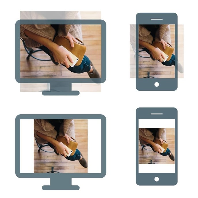
A square aspect ratio (1:1) image has been used in the images above to highlight what happens if the image is made to cover the entire screen or fit exactly. The CMS will behave as the top two and aim to cover the entire screen, which also eliminates the need for images stretching.
Rule of thumb - In general we work from the highest quality to the lowest. We upload images suitable for the highest quality required (background gallery image = 1920 X 1280 ) and the CMS resizes, crops and optimises for all other controls (banners, featured banners, content blocks and galleries).
3. Gallery page
The CMS does a good job of resizing and cropping images to fit various placeholders (banners & image carousels) of various width and height . The gallery page however is not cropped and scaled proportionally, allowing for a masonry (pinterest) style layout.
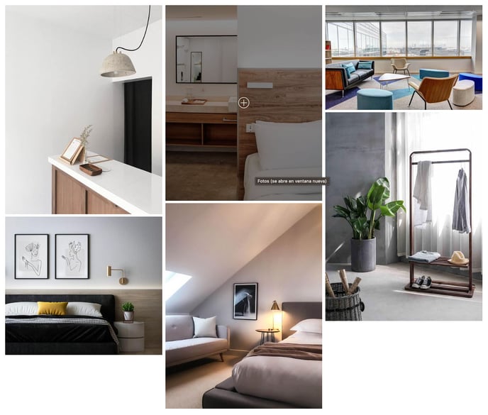
If you prefer an grid layout then make sure all your images are cropped to the same width AND height.