In the example below the client has added a menu image to the content editor with a fixed height and width.
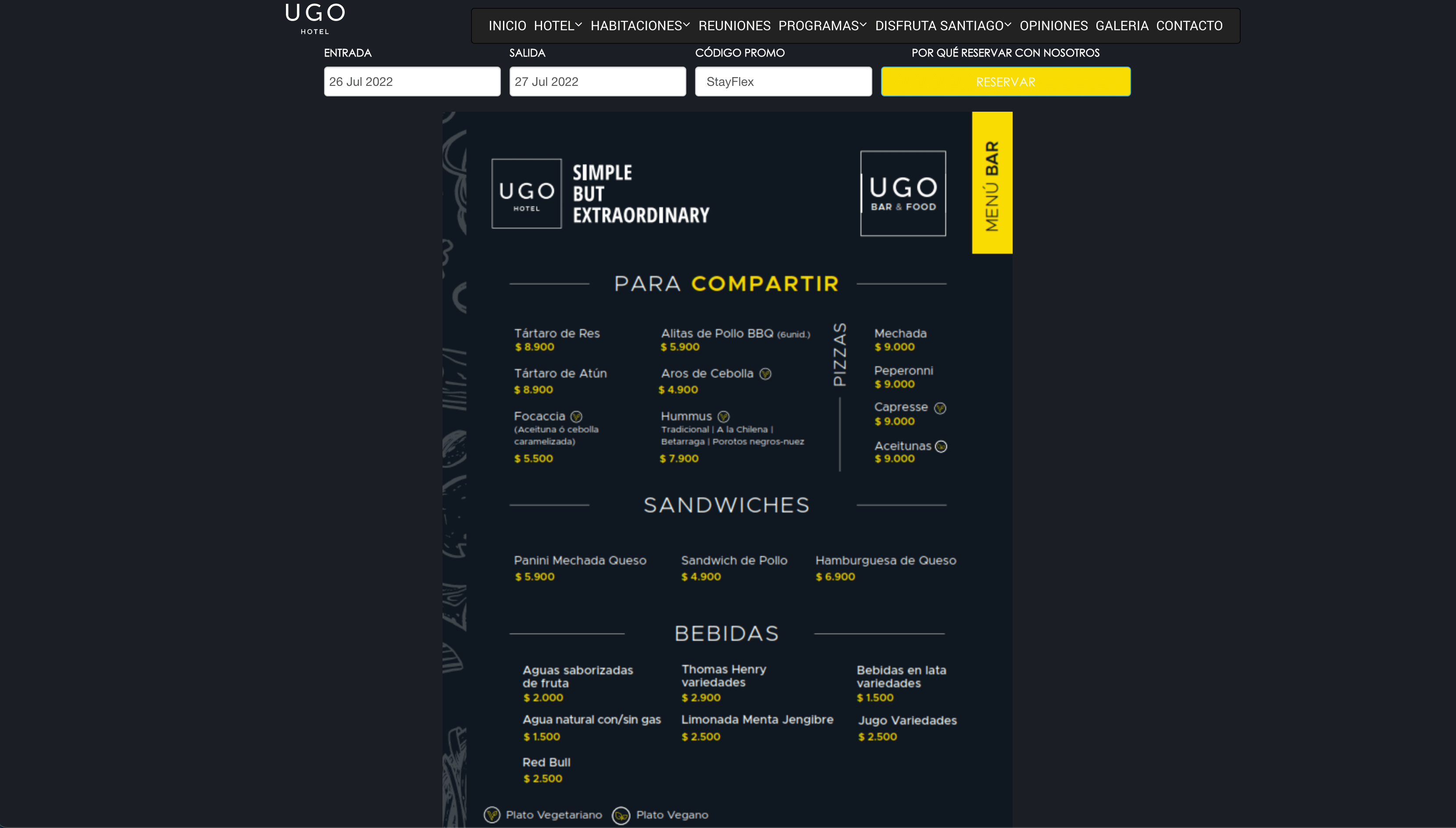 Menu added as an image to main content.
The problem arises when the image is viewed on smaller devices so the image does not adapt to the screen width.
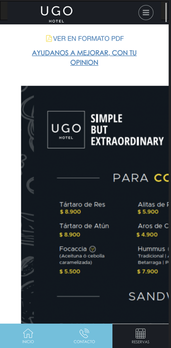
Image is not responsive on mobile.
We could use content blocks too very easily add an image to the content area, however the image will get cropped to a landscape size. This means that portrait images will loose the top and bottom of the image as they will get cropped to the centre of the image.
Read more: - Image Orientation & Aspect Ratio
See below the menu image added to the CMS main content area with a fixed width.
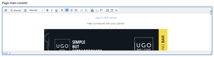
Menu image added to the CMS content editor.
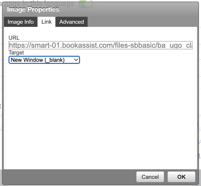
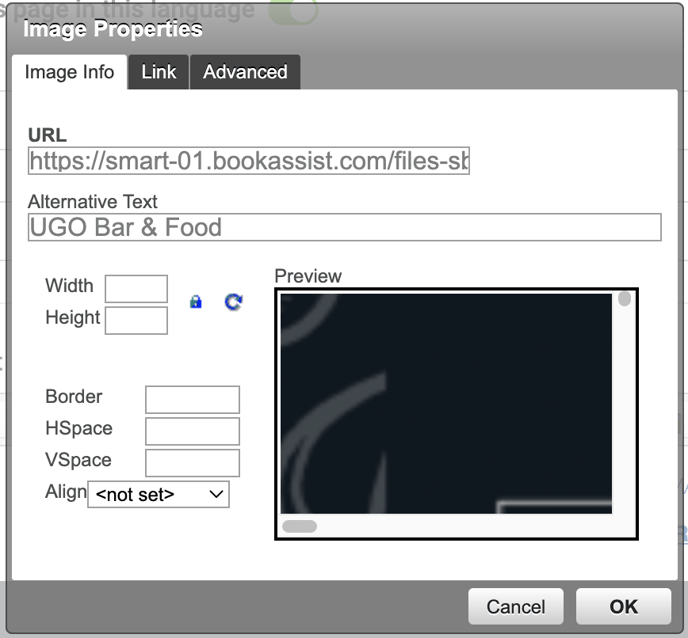
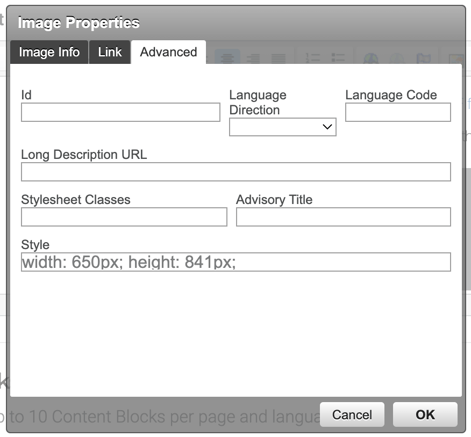 Double click on image to view Image properties and select "Advanced" tab. |
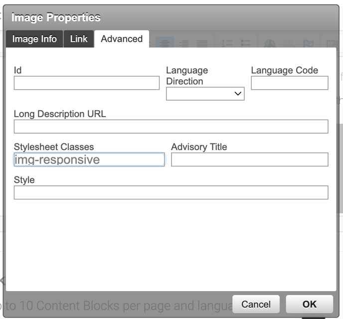 Remove the Style info and add Remove the Style info and add "img-responsive" class to the Stylesheet Classes field. Select OK. |
You must remove the inline Styles for width and height, in order for the properties of the Stylesheet classes added to take effect.
Is your website theme Klimt or Magritte?
The Stylesheet Class you must use is img-fluid NOT img-responsive.
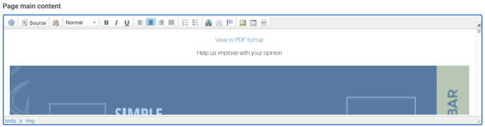 Image now expands to the full width of its container.
Note after the Stylesheet class has been added correctly the image now fills the containers space and as a result will resizes proportionally to the screen size on the website.
Read more about responsive images in bootstrap 3 documentation. The example here uses the "magritte" theme, but the most recent theme "klimt" has been ungraded to bootstrap 4.
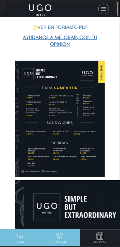
Menu image is responsive on mobile.
|
|
It also important to ass the Alternative Text to help improve SEO. |